
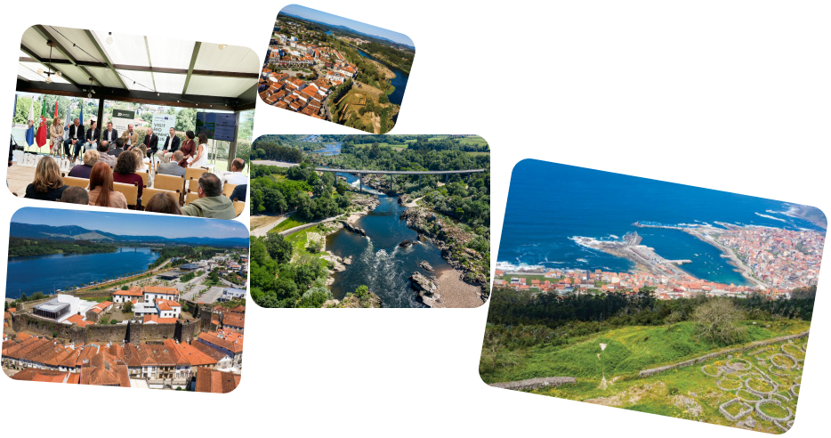
The Project
Positioning the Minho River as a leading
cross-border tourist destination
The Minho River Cross-Border Tourism Project, Visit Rio Minho Plus, is 75% co-financed by the European Regional Development Fund (ERDF). The project to consolidate the Rio Minho brand and create new cross-border tourism products, Visit Rio Minho Plus, is 75% co-financed by the European Regional Development Fund (ERDF) through the Interreg V-A Spain Portugal (POCTEP) 2021-2027 Program.
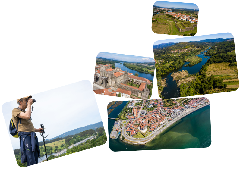
Consolidate Tourism Offerings
Provide the region with better governance tools for tourism.
Create a Tourist Destination
The project plans to create four tourism products, including nature and history trails and river routes.
Restore and Improve Infrastructure
To enhance the territory’s appeal to tourists, improvements to signage and accessibility are planned.
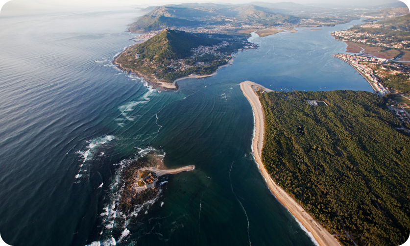
A Sustainable, Experiential, and Collaborative Tourist Destination
The Rio Minho brand is a project that aims to enhance and promote the cross-border territory, based on institutional cooperation, shared identity, and the diversity of its natural, cultural, and human resources. Its mission is to position the Rio Minho as a symbol of connection between Portugal and Spain and a reflection of a unique way of experiencing the border, built with the active participation of its communities.
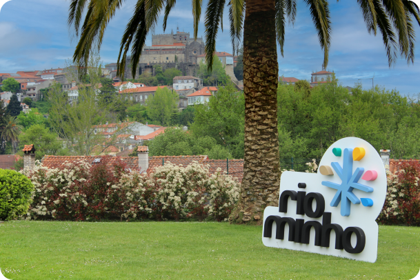
A European Benchmark in Sustainable Cross-Border Tourism
The Rio Minho brand aims to be a European benchmark in sustainable cross-border tourism, standing out for the authenticity of its landscape, the involvement of local communities, and the creation of shared value between the two banks of the river. This vision is based on collective intelligence, intercultural dialogue, and the territory’s ability to reinvent itself as a unique and connected destination.
Visual Identity
The Rio Minho brand is more than just a logo: it is the symbolic crystallization of a territory that is recognized for its fluidity, its common roots, and its potential for shared reinvention.
The Logo
The five-pointed star represents the branches of the river and its tributaries, evoking fluidity, plurality, and unity. Its asymmetrically balanced geometry conveys territorial diversity and dynamism.
Color palette
The institutional blue refers to Interreg and reinforces the European connection. Each tourism product is associated with its own color, in a living and expandable visual system.

Interreg

Enogastronomy

Culture

Nature

Heritage

Nautical
Want to know more about the Brand?
Visit the Media Kit page, where you can find all the resources related to the Visit Rio Minho Plus identity.

Blue
Blue symbolizes the energy and serenity of the Minho River.
It is the drop that invites you to discover the river as a sensory space and a place for experiences linked to the nautical world.

Pink
Pink is flavor, warmth, and conviviality. This drop reflects the gastronomic experience that preserves the essence of a living heritage: wines with character, local flavors, and recipes with soul.

Yellow
Yellow represents the ancient paths, fortresses, and legends of a border built together over the centuries, where history and memory intertwine.

Green
Green conveys balance and harmony and is associated with experiences of contact with nature. It symbolizes the tranquility that reigns between the banks, in a setting that invites you to slow down.

Gold
The fifth drop symbolizes openness to new experiences and micro-products, such as festivities, routes, local knowledge, and traditions. It is a space for growth and innovation.